
UX & Research
UI
Branding
Web
THE MISSION
One Designer. Three Systems. Zero Friction.
As the sole product designer for the IDF’s Data Branch, I led OASIS from abstract concept to operational reality. My mission was to orchestrate the convergence of Real-time Streaming, Data Discovery, and Analyst Tools into a single, seamless ecosystem.
THE CHALLENGE
Unifying three complex systems into one platform.
THE SOLUTION
From Chaos to Clarity.
OASIS integrates the modules into a cohesive platform, enabling fast, reliable data access and smooth workflows across roles and connected systems.
UX Research
COMPETITIVE ANALYSIS
Consumer UX, Zero Latency
As part of my UX research, I analyzed platforms like Kaggle, DataCamp, and Udacity. Each had strong features, but none offered a complete solution combining real-time streaming, advanced search, and security. This gap drove us to design a custom platform tailored to analysts’ operational needs.

USER PERSONAS
I conducted 15 user interviews (analysts, developers, commanders) to uncover usability challenges.
This research highlighted analysts as the primary persona and revealed recurring pain points - detailed below - which, together with the competitive analysis, led us to design a custom solution aligned with operational and analytical needs.
Meet Yossi: The Analyst Under Pressure.

PAIN POINTS
Search Challenges:
Difficulty finding specific data in the catalog due to unclear search results.
Inconsistent Systems:
Disparity in design and functionality between OASIS and other systems.
Complex UI:
Certain UI components in the Metro
(data streaming) module are not user-friendly.
The Conclusion: Operational Speed, Intuitive Guidance
Users face long loading times, complex interfaces, and mismatched data presentation vs. operational needs. New users require guidance and structured workflows, while experienced ones seek speed and efficiency.
UX GOALS
Intuitive Interface
Easy to use with clear navigation, enabling faster and smoother work.
Better Search
Add smart filters and auto-complete to help users find what they need faster
Easier Navigation
Use tabs or sections so users can find different types of data easily (like history, live data, insights)
Data Health
Shows if the data is working well, if there are any problems, and how much you can trust it.
Architecting Simplicity
Before a single pixel was drawn, we structured the logic. We transformed a fragmented search ordeal into a linear, seamless flow - reducing cognitive load at every step.
USER FLOW
We Architected the logic first—transforming a fragmented search ordeal into a single, seamless flow
.jpg)
INFORMATION ARCHITECTURE

To conquer the chaos, I crafted
a visual language of calm
Branding
MOOD BOARD
The mood board reflects tranquility and flow through water patterns, blue-purple gradients, and geometric symmetry. This visual language inspired OASIS’s brand identity: refined, fluid, and dynamic.

TYPOGRAPHY & COLORS

LOGOS
Main Logo
The OASIS logo reflects its essence as a "data oasis." The ripple-like "O" symbolizes the flow of information, while the water-inspired colors convey clarity and depth, highlighting the system as a serene hub for knowledge.

Mesh
Catalog
Metro

OASIS Module Logos
-
Metro: Streaming lines in the "M" symbolize real-time data flow.
-
Catalog: Hexagons represent structured and fast data discovery.
-
Mesh: Overlapping shapes reflect data integration and SQL manipulation.
Each logo aligns with its module's purpose for clarity and cohesion.
UI KIT
.png)
ICONOGRAPHY

Design with Impact
OASIS delivers a simple, accessible and real-time experience for military users. With my product background,
I balanced UX clarity with organizational needs.
50%
Fewer user errors thanks to clearer workflows
35%
Faster access to critical information.
Better data flow with fewer support requests.
30%
The Concept: Bridging the Gap
I identified three critical friction points in the legacy system. Our strategy was to transform these operational bottlenecks into streamlined, intuitive experiences using the "Oasis" design language.
Intuitive Interface

Visual Clarity: Large touchpoints and a focused question turn a complex technical setup into a simple, confident choice

Operational Empathy: A dark UI that adapts to the War Room reality, removing physical strain so soldiers can intuitively focus on the data, not the glare.
Better Search

Guided Discovery: The search bar Anticipating the user's intent to turn manual typing into one-click selection, cutting search time by half.

Semantic Discovery: An AI-driven search that translates complex operational questions into a curated list of verified sources.
Easier Navigation

Breadcrumbs
Tabs
Constant Orientation: Breadcrumbs and Tabs act as visual anchors, ensuring analysts never lose contex - even when navigating deep data hierarchies.
Data Health
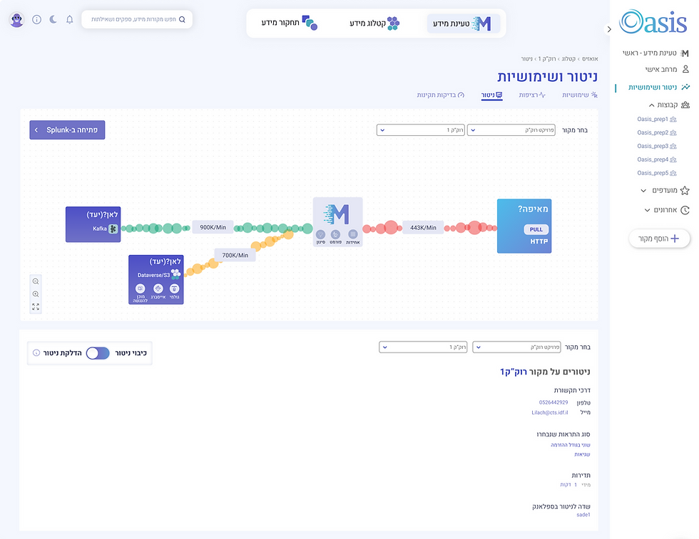
Transparent Reliability: The system doesn't hide errors; it exposes them. Clear 'Health Scores' let users know exactly when to trust the data.

Data Health isn't just a status light. Users can actively run validation tests on sources to verify integrity and latency in
real-time.
UI Design

Future Features
AI-powered contextual search
delivers precise sources in response to business questions, streamlining decision-making.
personalized UI customization
allowing users to tailor the interface to their specific needs and workflows
collaborative features
share sources, leave comments, and rate the relevance of information
Thank you!

Other Work?


.jpg)