Vibe Coding

One designer. Three systems. A unified data platform that turns fragmented military workflows into operational clarity.
Role
Sole Product Designer
Year
2025
Org
Matzpen Unit, IDF
Measured impact
50%
Fewer user errors
35%
Faster data access
30%
Fewer support requests

As the sole product designer for the IDF Data Branch, I was brought in to unify three independent tools into a single, coherent platform. Each module had been built separately, with its own logic, visual language, and user base. They coexisted, but they did not work together.
The brief sounded straightforward. In practice, the challenge was not adding features. It was removing the mental overhead analysts carried every time they moved between systems, each with its own interaction patterns and structure.
Real-time data streaming for live operational feeds.
Structured discovery across the organization's data assets.
SQL manipulation and cross-source data integration.
The existing setup forced analysts to move between three separate systems that shared no common structure. Slow data loading, inconsistent interfaces, and a presentation layer that did not reflect operational reality meant users spent more time navigating the tools than doing their actual work.
New users struggled to orient themselves. Experienced ones had built workarounds just to function. The system was not failing dramatically; it was quietly eroding efficiency every single day.
“I spend more time finding the data than analyzing it.”
Recurring theme across 15 user interviews
Before opening Figma, I audited comparable platforms: Kaggle, DataCamp, and Udacity. Each excelled in isolation, but none combined real-time streaming, advanced search, and the security constraints required for an operational military context. The gap was architectural, not cosmetic. I also ran 15 user interviews across analysts, developers, and commanders to understand how each group actually used the existing tools.
The interviews revealed that the platform served three very different user types. Each had legitimate needs that sometimes pulled in opposite directions. Designing for one group without considering the others would have solved only part of the problem.

Primary users. They needed fast, reliable access to data sources without switching between systems under time pressure. Speed and confidence in the data were non-negotiable.
They needed access to raw, structured data and integration capabilities. They valued technical depth and clarity about source schemas and status.
Less technical, but equally dependent on the platform. They needed a clear, trustworthy operational picture without being overwhelmed by technical details.
Users could not find relevant data sources quickly. Missing filters, unclear results, and no autocomplete made every search a manual effort.
Each module had its own interaction logic. Switching between Metro, Catalog, and Mesh felt like switching applications entirely.
There was no clear way to know whether a data source was healthy, stale, or broken before using it. Users had to assume and discover problems later.
After identifying the main friction points, I translated the research findings into product decisions designed to reduce cognitive load, improve discovery, and support both technical and non-technical users within a single product. Each decision traces back to a specific user pain point.
Research insight
Users spent more time searching across fragmented systems than analyzing data. There was no single starting point.
Product decision
Make the Catalog the central entry point for discovering, understanding, and accessing operational data.
Research insight
Analysts, developers, and commanders had fundamentally different needs but were forced into the same interface with no separation.
Product decision
Separate the experience into clear tabs based on data type and user intent, so each group can navigate without losing context.
Research insight
Finding a relevant data source required manually browsing long lists with no filtering or prediction support.
Product decision
Add structured filters and autocomplete to shorten the path from search intent to result, especially under operational pressure.
Research insight
Users had no way to assess source reliability before committing to an analysis. Errors were discovered too late.
Product decision
Surface source status, errors, and integrity indicators close to the relevant data, so trust assessments happen before use.
Research insight
Non-technical users felt excluded from the platform while technical users found it too shallow for detailed work.
Product decision
Design a layered experience: a clear high-level structure for orientation, with technical depth available when needed, in the same product.
These were not aspirational principles. They were constraints that governed every interaction pattern, navigation structure, and information hierarchy that followed.
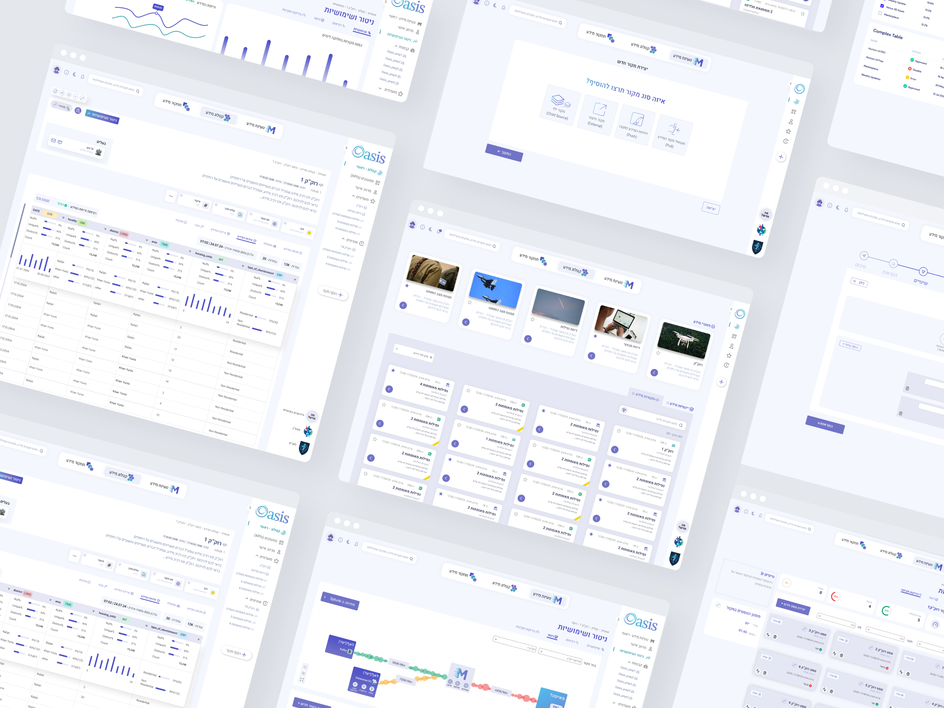
Instead of forcing users to search across fragmented systems, I designed the Catalog as the central entry point for discovering, understanding, and accessing operational data.
To reduce complexity without reducing capability, I separated the experience into clear tabs that help users move between data types without losing their context or orientation.
Because users needed to find relevant information quickly under pressure, I added structured filters and autocomplete to shorten the path from search intent to result.
To help users trust the data they were working with, I surfaced source status, errors, and integrity indicators close to the relevant data sources, not buried in a separate monitoring view.
The platform needed to support analysts, developers, and commanders. The design balances technical depth with a clear structure so advanced users can access details while non-technical users can still understand the operational picture.
The hardest design challenge was supporting very different user types within the same product. Analysts needed depth. Developers needed access to raw and structured data. Commanders needed confidence and clarity without being overloaded by technical details.
Simplifying the product too aggressively would have removed the depth technical users depended on. Exposing every technical detail by default would have made the system harder to use for non-technical stakeholders. The solution was a layered experience: a clear high-level structure for orientation, with deeper details available when actively needed.
Prioritized for MVP
Kept deliberately simpler
Left for future iterations
Before a single screen was designed, I structured the information architecture. A fragmented, multi-step search ordeal became a linear, guided flow. Reducing cognitive load at every step was not a design preference. It was the primary requirement.


In a war room environment, visual noise is a liability. I crafted a brand rooted in tranquility and flow: water patterns, blue-purple gradients, and geometric symmetry. The goal was a system that signaled clarity even before the user read a single label.
Mood Board

Water patterns, blue-purple gradients, and geometric symmetry: the visual anchors of the Oasis brand.
The ripple-like “O” symbolizes data flow. Each module logo reflects its function: streaming lines for Metro, hexagons for Catalog, overlapping shapes for Mesh.

A shared component library and custom icon set gave the three modules a coherent visual grammar for the first time.

Each design decision translated into a concrete UI pattern, traceable directly to a user pain point. The four principles below governed what got built and how it was structured.
Large touchpoints and a dark UI adapted to the war room remove glare so analysts focus on the data, not the screen.


Autocomplete anticipates intent, turning manual typing into one-click selection. AI search translates operational questions into curated source lists.

Breadcrumbs and tabs act as visual anchors across deep hierarchies. Analysts never lose context between Metro, Catalog, and Mesh.

The system does not hide errors. Clear health scores and active validation tests let users verify source integrity before committing to an analysis.


A cohesive experience spanning all three modules, unified for the first time by a shared design language and component library.
After implementation, the product was evaluated through stakeholder feedback, user feedback from the primary analyst group, and direct comparison with the previous workflow. The improvements focused on three areas: reducing search time, lowering error rates, and helping users access operational data with more confidence.
Results were validated through feedback and workflow comparison, not automated analytics. The numbers reflect real operational changes, not modeled projections.
50%
Fewer user errors through clearer workflows and source reliability signals
35%
Faster access to critical information through catalog-first navigation
30%
Fewer support requests as users found answers within the platform itself
This project reflects the type of work I find most meaningful: turning complex, high-stakes operational systems into products that are clear, usable, and trusted. My role was not only to design screens. It was to shape the product logic, reduce systemic complexity, support multiple user types, and create a scalable experience that could grow with operational needs.
Three systems did not fail because of missing features. They failed because analysts had to rebuild their mental model at every module boundary. That is a design failure, and design had to fix it.
15 interviews gave me the evidence to cut complexity and make focused decisions. Without that foundation, every feature looks essential. With it, you can prioritize deliberately and explain every trade-off.
In high-stress operational environments, visual calm is functional. The water-inspired brand was not decoration. It was the system telling users: you are in the right place, trust what you see.
Supporting analysts, developers, and commanders in a single product required a layered information structure. Not separate products, not a lowest-common-denominator design, but a system that rewards depth without demanding it.
More to love
